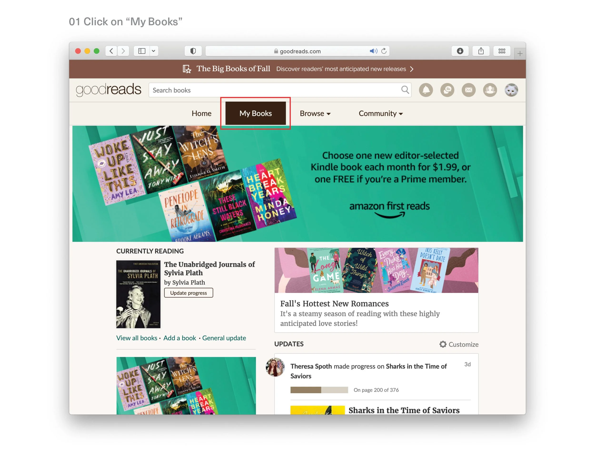
As a redesign challenge, I focused on one feature to improve on a website I frequently visit, Goodreads.com. I chose to update the ‘my books’ feature which is a categorized reading log.
As an avid reader, I would love to have an intuitive digital space to catalog the books I read and want to read. Goodreads is vast resource, I use it to log my reading progress, find recommendations, and build a reading community. However, the website could use enhancements that improve the flow of it’s features.
Using Nielsen Norman's guidelines , I conducted a heuristic evaluation and outlined recommendations with low fi wireframes using tools such as InDesign and InVision.
Design Challenge Feature Redesign
Design Challenge 2023: Redesign one feature on the Goodreads website.
Research - User flow analysis
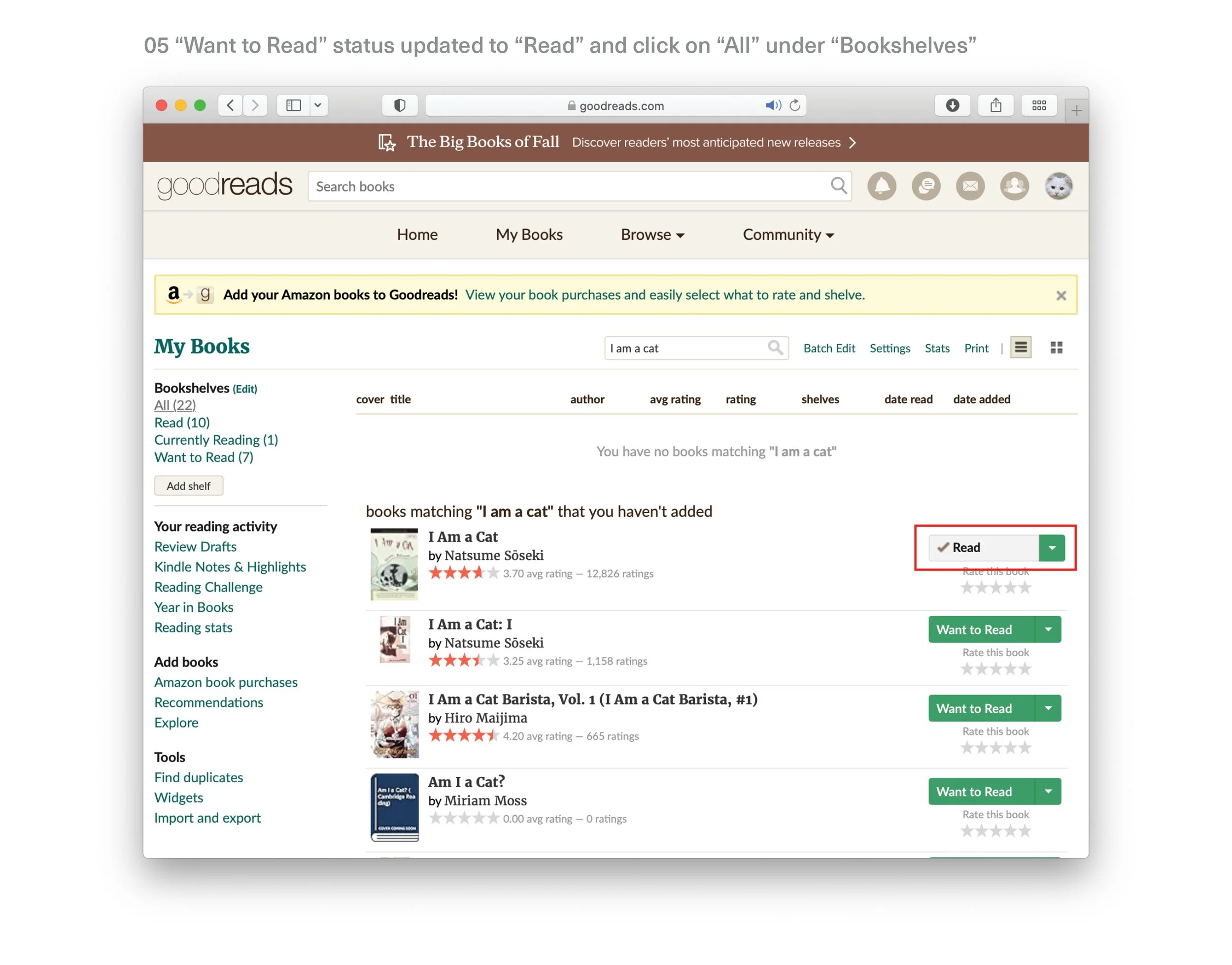
The current end-to-end flow to add a book to “My Books
Problems for users:
No call to action for adding a book entry
No clear call to action for adding a book entry
Lack of visual indication of what tab the user is on
Inconsistent text stylings (header sentence case and edit hyperlink)
Unknown verbiage, users might infer that shelf means bookshelves
No back function to “My Books”
Confusing default selection of reading status dropdown
Post modal only comes up when user selects “Read” progress status in dropdown
Lack of visual prominence of “post” call to action
No confirmation of reading progress change
Update in progress status does not direct user to respective bookshelf page
No confirmation of new book entry
Deliverables
Recommendations and low fidelity wireframes for an improved user experience
Progress Dropdown
Wireframes with a more intuitive default option and display
Confirmation Banner
Banners with an indication of changes made to book entry details


