Digital GI Bill (DGIB)
The Digital GI Bill (DGIB) is a Veterans Affairs initiative to modernize the processing and delivery of education benefits to veterans and their families.
From July 2022 to October 2023, I contributed as a design analyst and interaction designer, shaping UX for the site transformation through lo- and high-fidelity wireframes, user flows, and SME guidance for a 125-person workflow. My responsibilities included:
Project and sprint planning
Translating design requirements
Presenting solutions to stakeholders
Collaborating closely with developers
Conducting user research through 30+ prototype walkthroughs, surveys, and scripted prompts
Deliverables
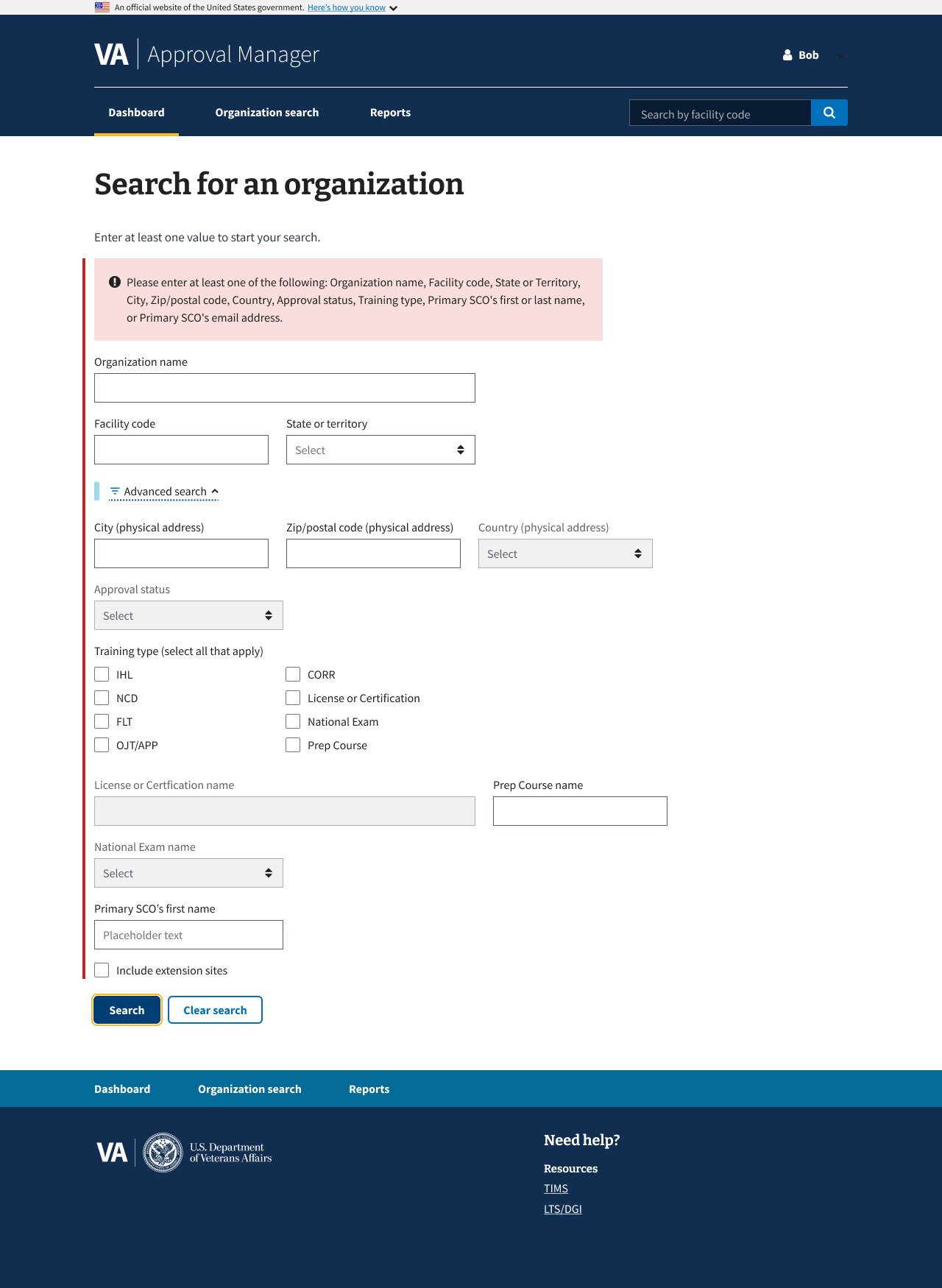
01 Collection: Search Criteria
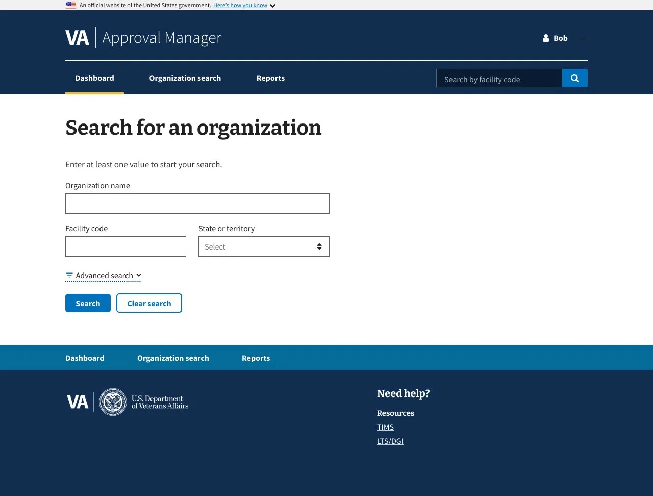
1.0 Default Simple Search
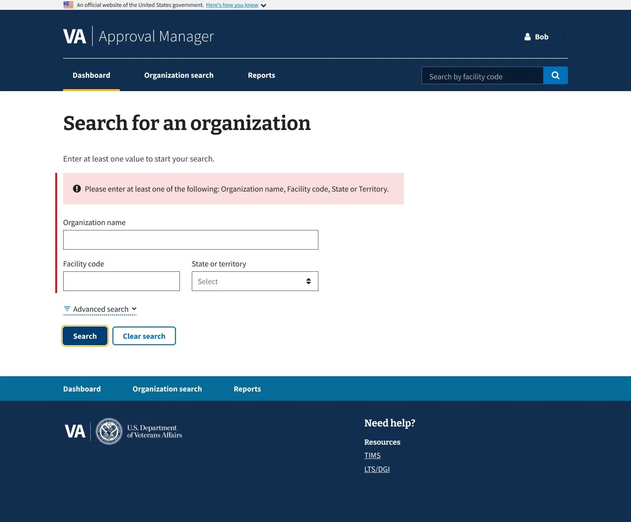
2.0 Simple Search Error Message
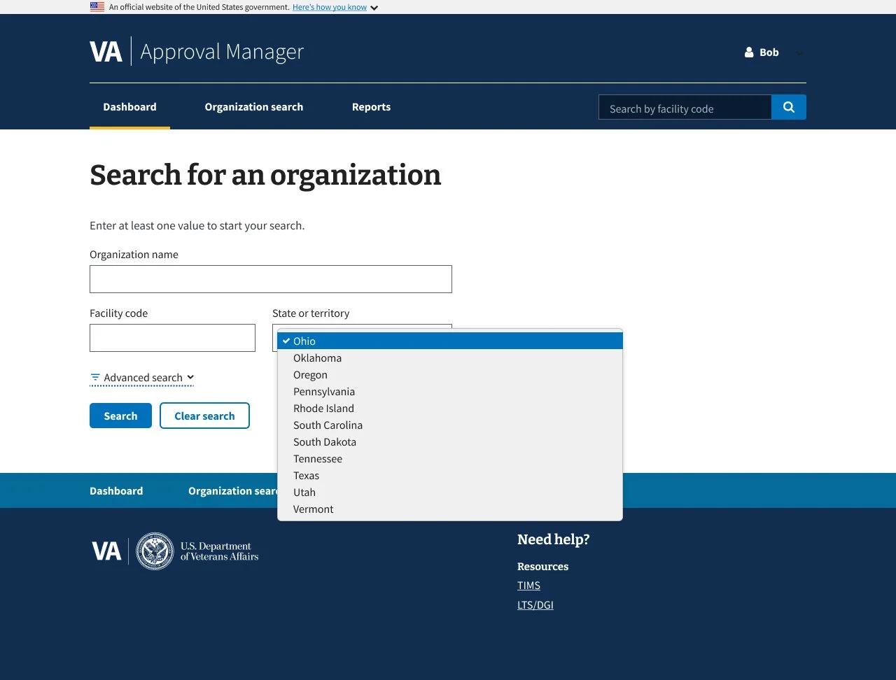
3.0 Simple Search Dropdown
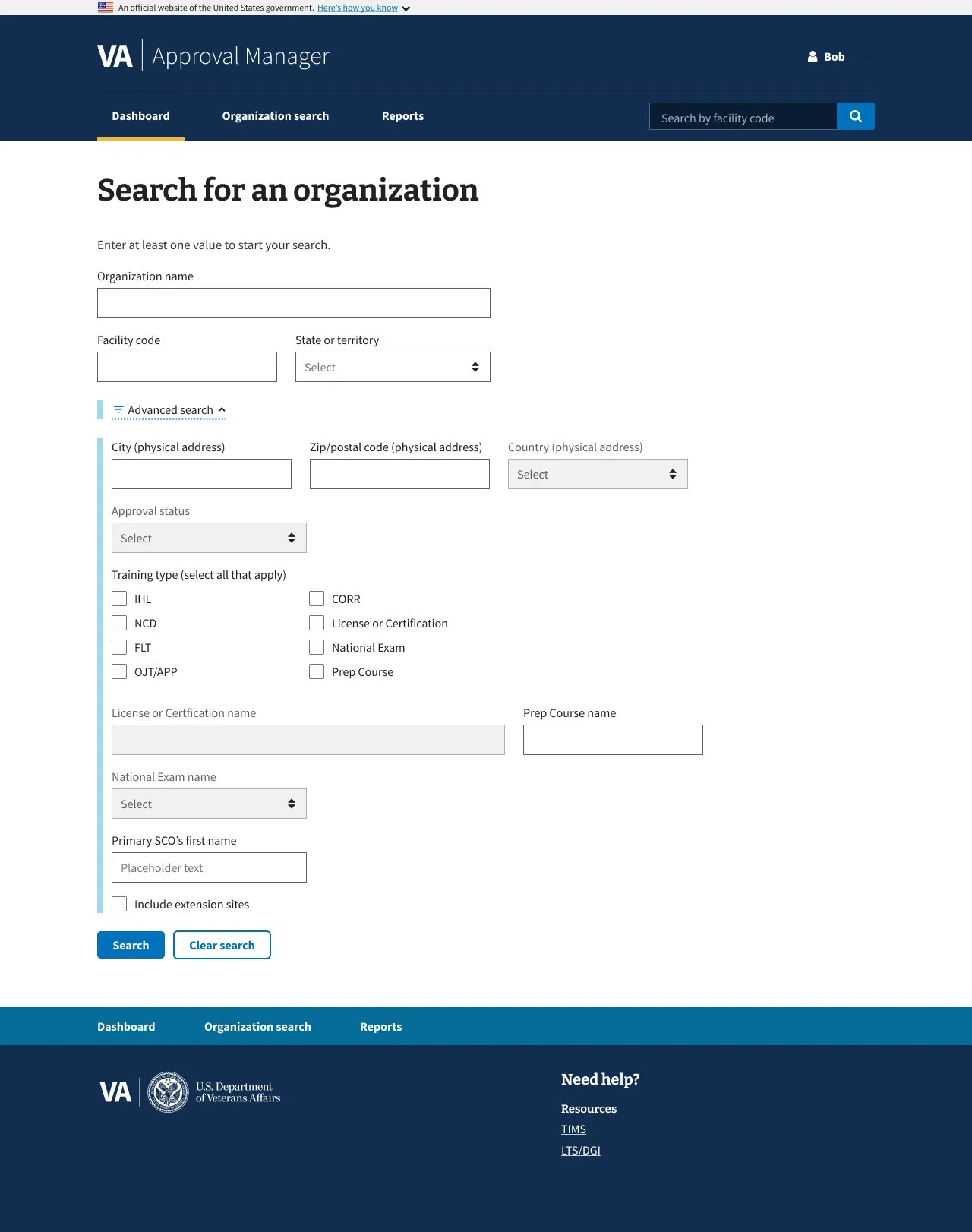
4.0 Advanced Search
5.0 Advanced Search
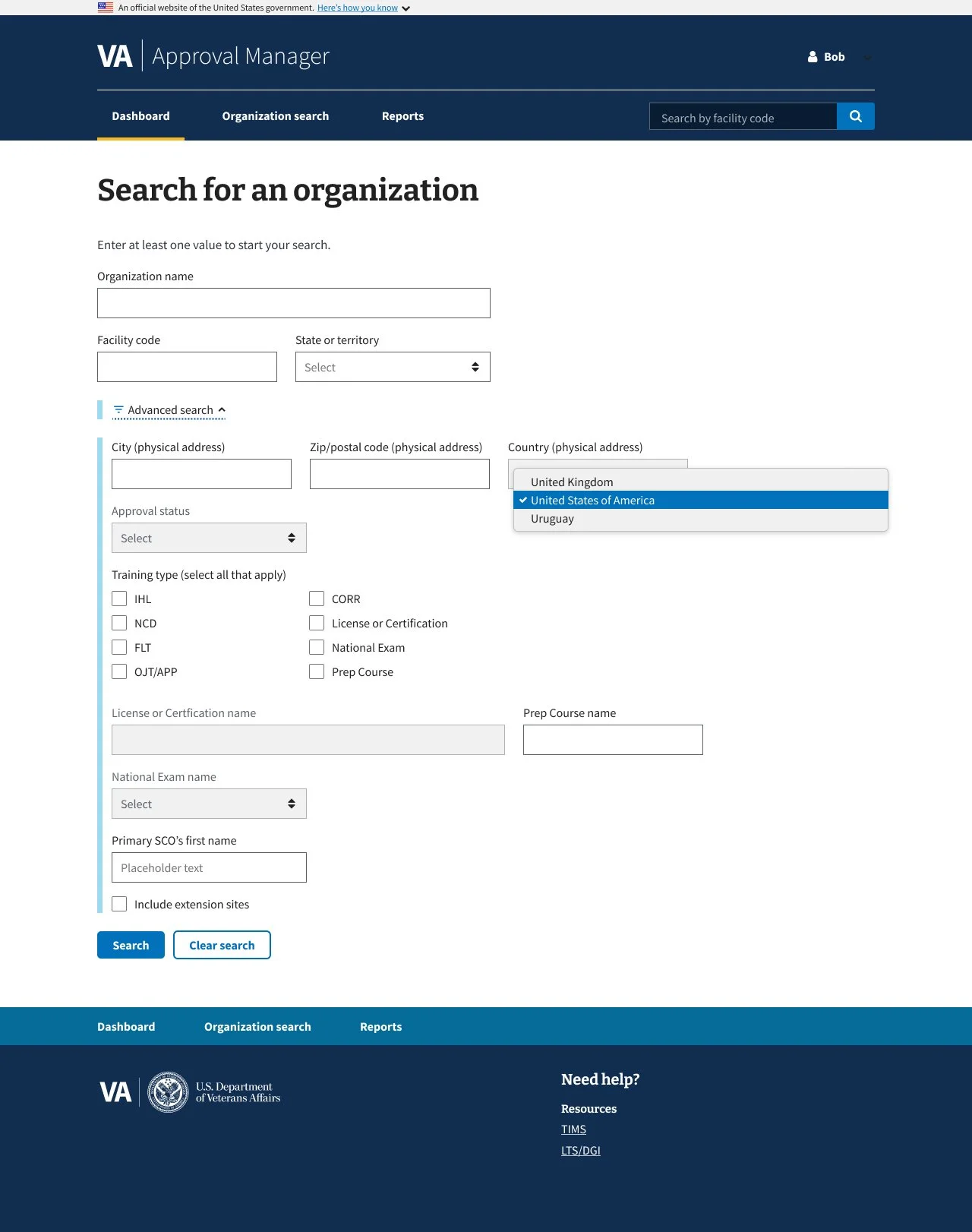
6.0 Advanced Search Dropdown
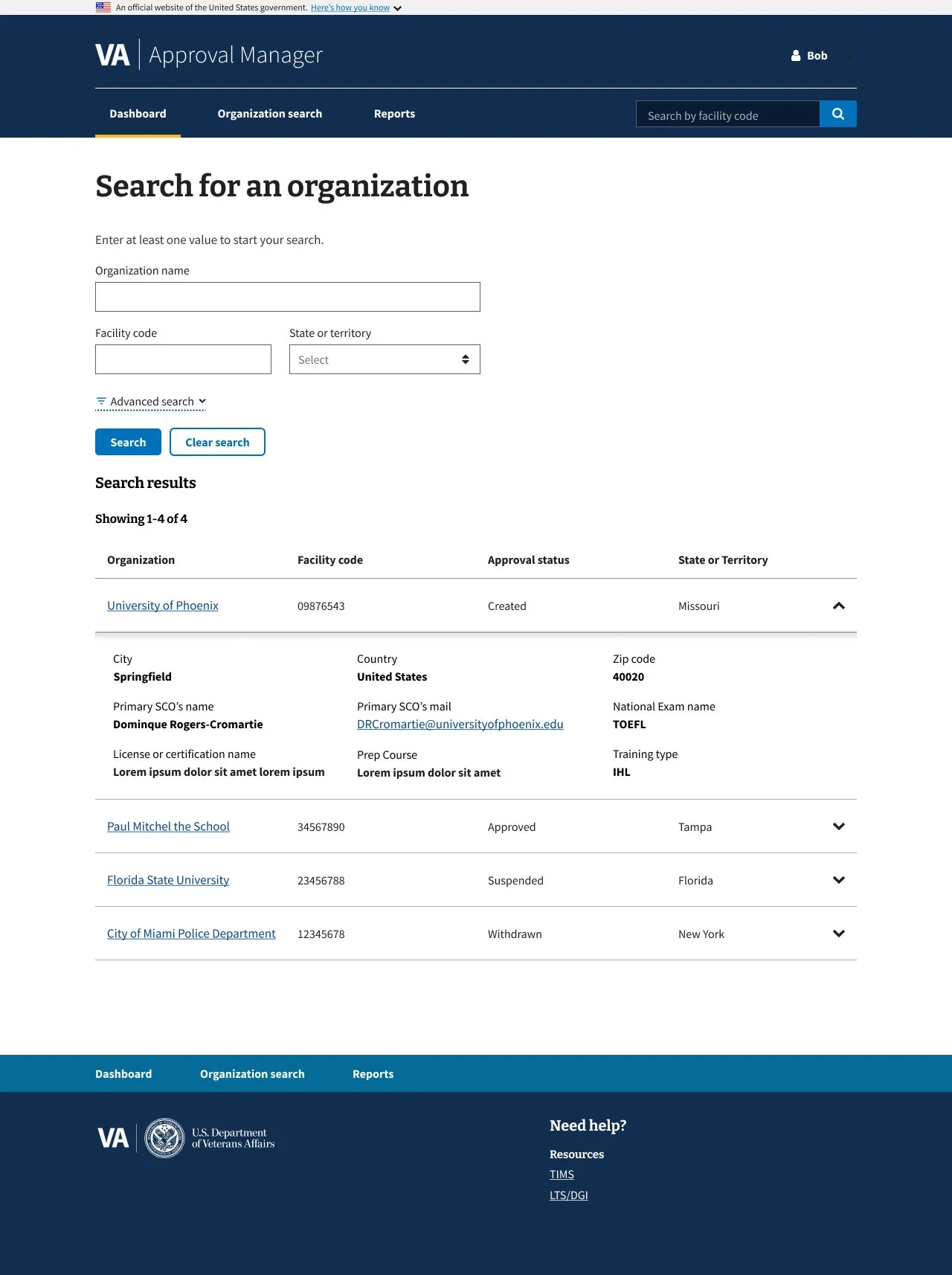
8.0 Advanced Search Results
Project Context - The DGIB search tool helps users find education providers based on specific criteria.
The existing search panel was cluttered and confusing: unclear labeling, poorly grouped filters, and a lack of guidance made it difficult for users to apply search criteria effectively. This often led to errors or incomplete searches.
During the redesign, I collaborated cross-functionally with developers and strategists to improve clarity and usability while preserving the tool’s logic for both simple and advanced search modes.
Design Solutions - The search experience was improved by:
Added contextual explanations for each filter to clarify purpose
Used progressive disclosure to reduce visual overload
Grouped related filters for improved legibility and scanning
Key Takeaways -
Progressive disclosure is highly effective for simplifying complex tools
Inline guidance can coexist on the same page as the tool
Small layout and labeling adjustments can significantly improve usability
02 Collection: School Certifying Official (SCO) and Plans of Care (POC) Tab
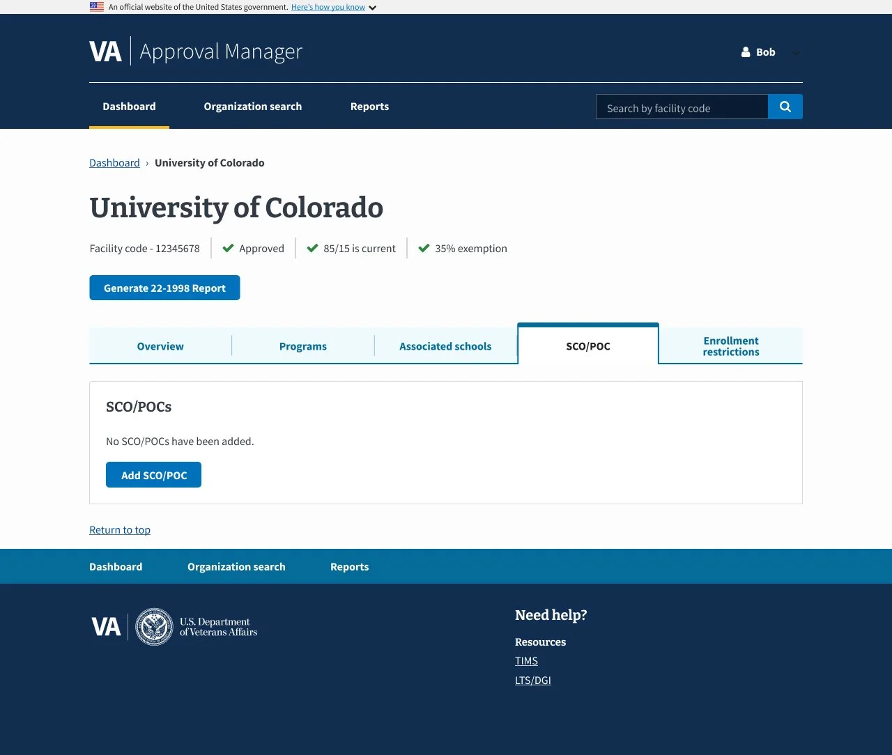
1.0 SCO/POC - No Data
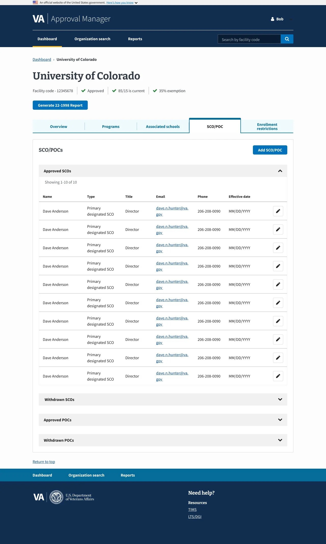
2.0 SCO/POC - Default
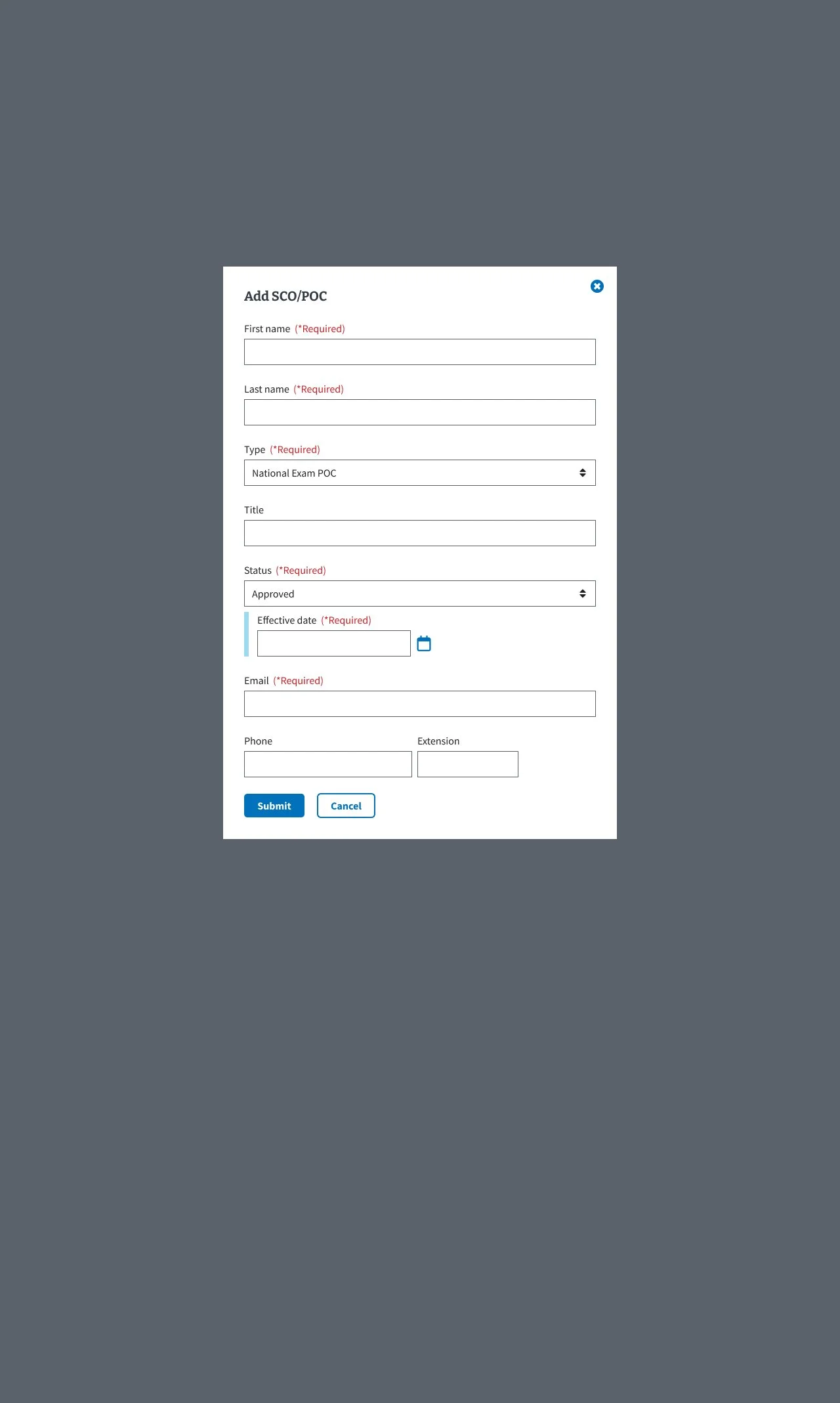
3.0 SCO/POC - Add SCO/POC Modal
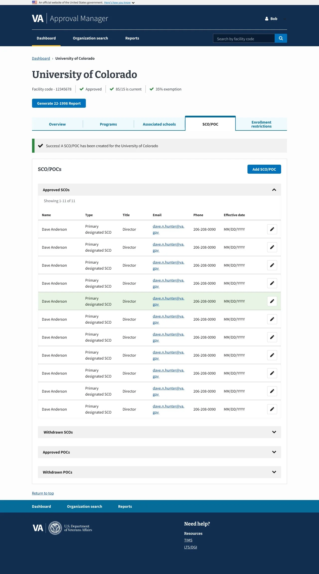
4.0 SCO/POC - Added POC/SCO Confirmation
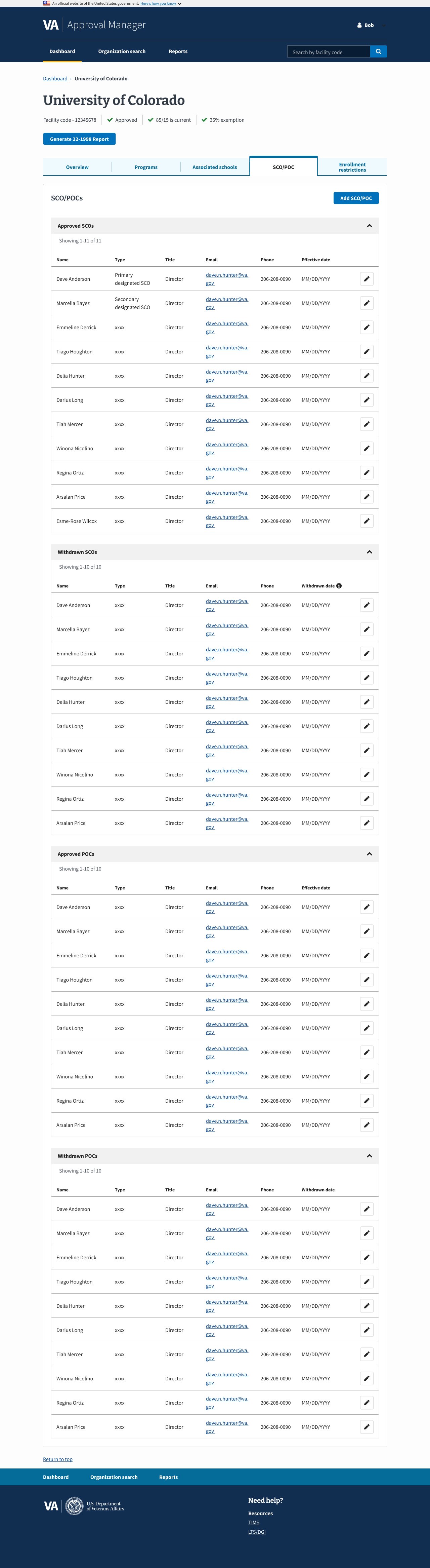
5.0 SCO/POC - All Tables Expanded
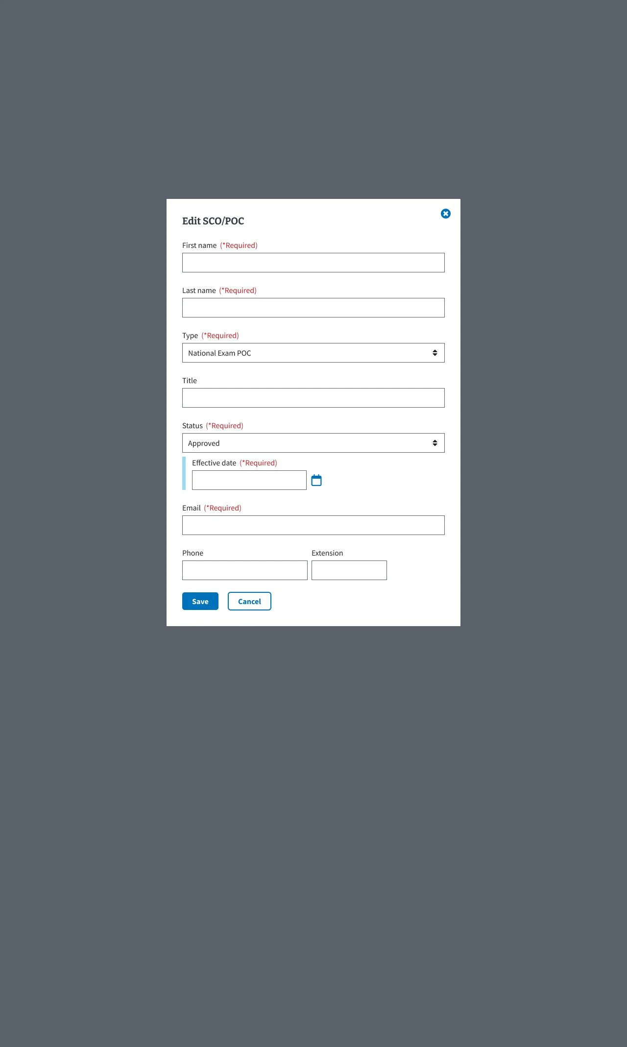
6.0 SCO/POC - Edit POC/SCO Modal
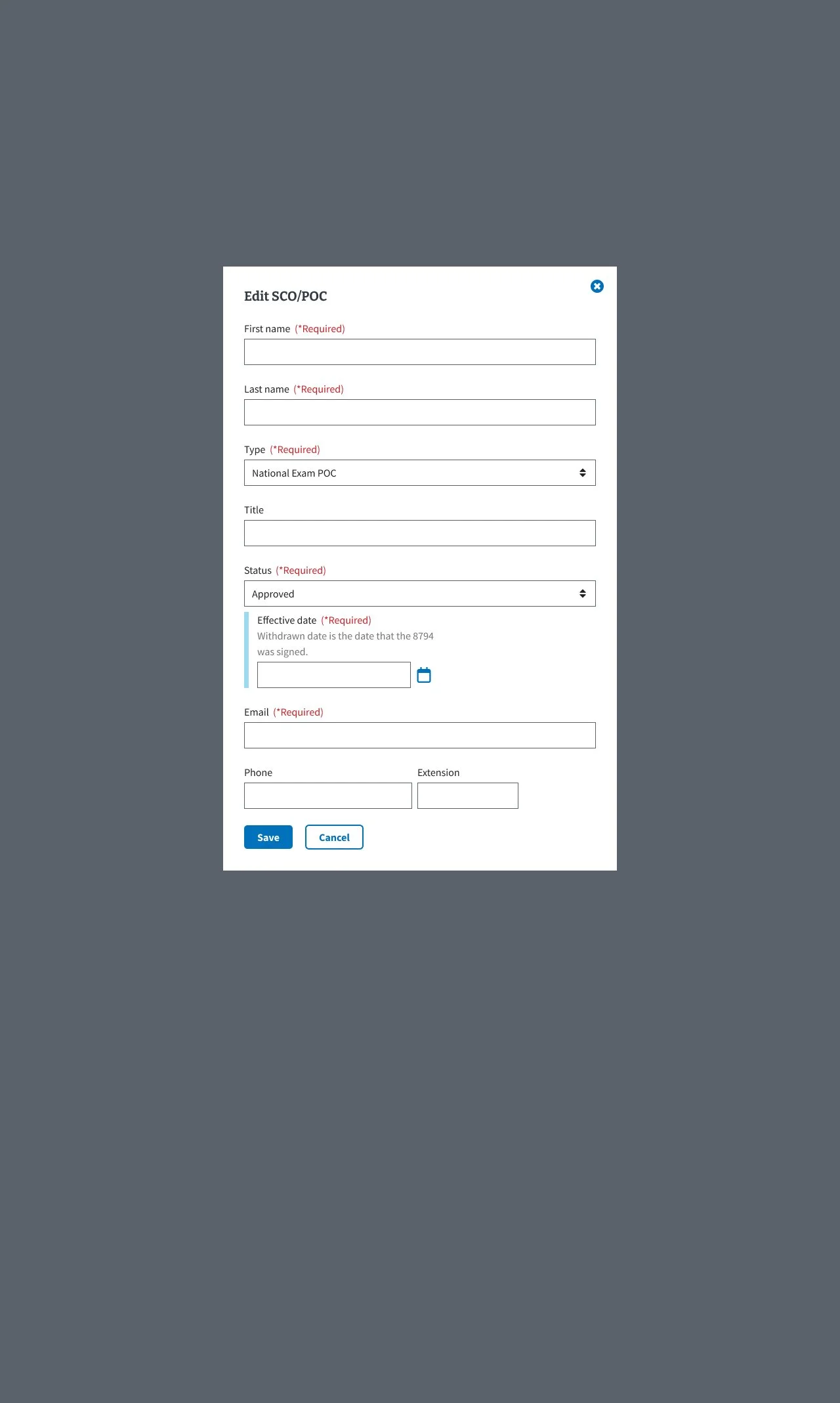
7.0 SCO/POC - Edit SCO/POC Modal w/Conditional Field

8.0 SCO/POC - Edited POC/SCO Confirmation
Project Context -The SCO/POC tab in the Digital GI Bill Approval Manager helps manage School Certifying Officials’ access and certifications while tracking veterans’ Plans of Care for compliance and benefit processing.
Users needed a clearer, more efficient way to manage SCOs and POCs, as the existing interface was cluttered and confusing, making it difficult to add, edit, and confirm records. This often caused errors and uncertainty about whether changes were saved. The redesign focused on improving usability and ensuring accessibility compliance.
Design Solutions and Impact - The redesign delivered a smoother, more intuitive experience with fewer errors and higher user confidence by:
Implementing focused modals for adding and editing entries to reduce visual clutter
Providing clear visual confirmation for user actions
Designing a responsive interface to ensure accessibility across devices
Key Takeaways -
Breaking complex tasks into focused steps improves usability
Providing immediate feedback builds user trust
Cross-team collaboration is essential to meet both user and compliance requirements